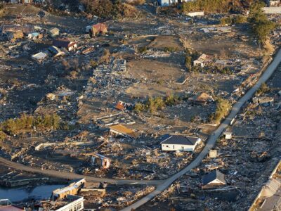
From wildfires across the West, to hurricanes in the Southeast, to floods in Texas, natural disasters are taking a toll on regions across the country. And climate change is increasing the frequency of devastating climate and weather events.
A newly revamped tool from the National Center for Disaster Preparedness (NCDP) at Columbia University’s Climate School aims to help communities better prepare for natural hazards by providing data-driven information about the specific risks that different geographic areas face. The Natural Hazards Index map application is a publicly available, interactive map that illustrates the hazard level of 14 different natural hazards across the United States and Puerto Rico, including extreme heat, earthquakes, landslides, tornadoes, and floods. The tool was updated in partnership with the investment firm AllianceBernstein.
“We saw a need to develop a tool to help people better understand the risks that they face in their backyard,” said Jonathan Sury, the project lead and senior staff associate with the NCDP, which works to understand and improve the capacity to prepare for, respond to, and recover from disasters. “The first step of preparedness is to know your risks.”

The hope is that the tool can provide people and communities with the information they need to develop strategic disaster response plans and accelerate efforts to reduce risks and vulnerabilities. Sury expects this tool will be utilized by health departments, municipal groups, emergency management, households and individuals, academics, and others.
“This will help tell the story of a community and help raise awareness about what could happen on a local level,” Sury said. “It’s a preparedness tool — but this is also a communications and advocacy tool for the important mitigation activities and critical investments that can help address climate and weather vulnerabilities.”
The map offers both an aggregate illustration of the collective natural hazard risk within a geographic area, specifically a census tract, and a breakdown of each of the fourteen specific hazards. It also provides links to valuable information to guide both the small and large actions that can help households and regions reduce the risk of natural disasters and bolster their response plans. These recommendations could include reducing burnable materials around houses and businesses in fire-prone areas or investing in more resilient infrastructure, which is often a tougher sell because of the upfront cost.
NCDP first developed a version of this tool in 2016, but identified an opportunity to improve it with more precise and localized data at the census tract level. The initial tool was limited by county-level mapping data, but the new version allows users to hone in on more specific areas and see the differences that can exist within a county — which can be significant.
“There’s so much more that can be gleaned when you’re able to zoom in on the sub-county level,” said Sury.
For example, a neighborhood by a river may face significantly different flood risks than one on a hill. Or, the wildfire risk may vary drastically depending on where you are within the urban wildland interface, he explains, much like the heat index can change depending on how close you are to the water.
The tool is designed to be very user-friendly. It presents information in a digestible manner that anyone can interact with and benefit from.
But, the work that went into it was anything but simple, says Sury. The NCDP had a rigorous process for building this tool, which started by identifying which hazards to include on the map. They did a literature review for each potential hazard and spoke with key experts to get their insights about the relevance of each respective risk and the best data and indicators to use for each hazard. They also collaborated with colleagues at the Columbia Climate School and balanced the input they received with the availability, reliability, and granularity of data. The map incorporates terabytes of data, which is equivalent to trillions of bytes of data.
This tool was developed through a partnership with AllianceBernstein, a leading global investment management and research firm and longtime Climate School supporter. NCDP engaged with AllianceBernstein investors for more than a year to develop the tool by updating and refining datasets and identifying and adding new data. AllianceBernstein saw an opportunity to use the tool to analyze and better evaluate the various risks to its investments.
“We see a lot of potential to use this tool in our investment decisions — and it was clear that this partnership could also benefit communities around the country,” said Patrick O’Connell, AllianceBernstein senior vice president and director of fixed income responsible investing research.
O’Connell points out that hardening infrastructure in the private sector can also offer an immense benefit to the general population, as protecting factories and businesses can prevent disruptions to the supply chain, services, products, and jobs when a disaster hits.
“The private sector is such a critical player in disaster preparedness and response and recovery,” he said. “When corporations and local jurisdictions are investing in mitigation and preparedness, it’s so valuable to all stakeholders.”
While the group is excited about the rollout of this phase of the application, they’re already thinking about the next iteration, which will incorporate climate change projections and social vulnerabilities. A lot of current data, like hurricane data, is based on today’s climate and doesn’t factor in climate change. The group hopes to integrate improved data in the future to show how climate change will affect natural hazards and disasters.
“We have great baseline hazard information in these maps,” Sury said. “And now we want to better account for climate change projections and what future hazards will look like on a warming planet.”


